

 Downloader
 Free FTP
What Is CRI in Lighting? Why It Matters More Than You Think
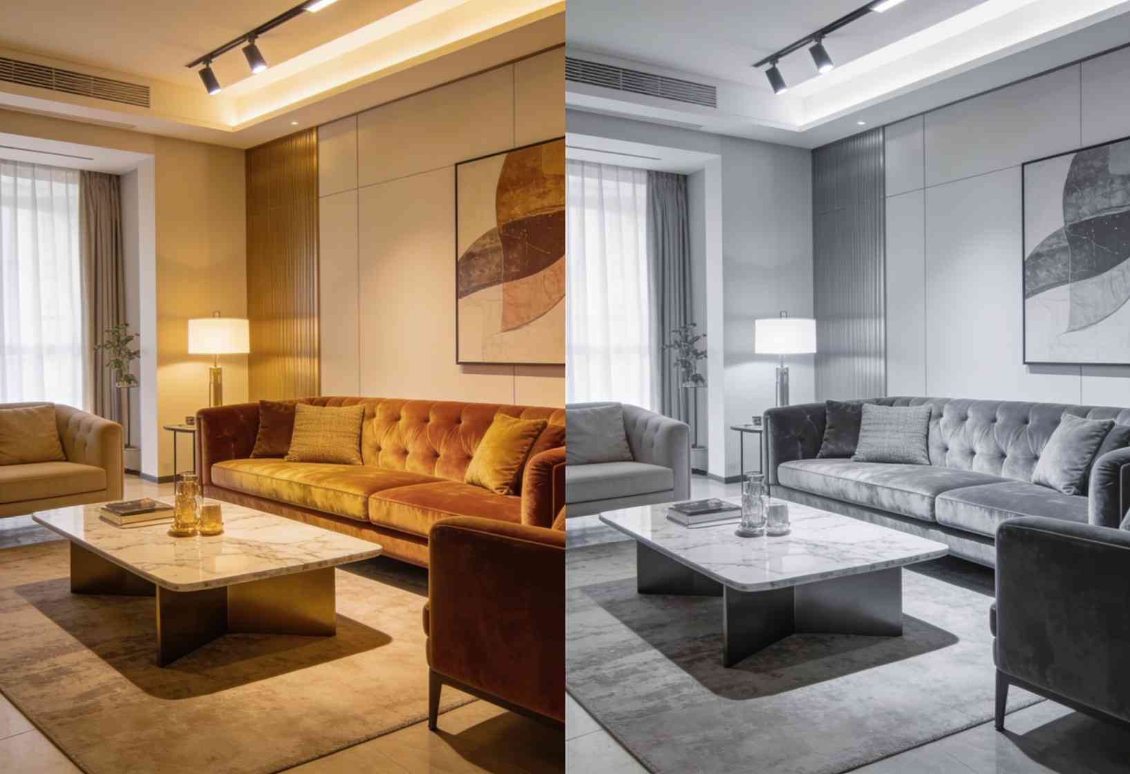
CRI, or Colour Rendering Index, is a measure of how accurately a light source shows the true colours of objects compared to natural daylight. It's rated on a scale from 0 to 100 — the higher the number, the more true-to-life colours appear. A CRI of 90 or above is considered excellent and is recommended for homes, while cheap lighting often sits at 70–80, making colours look dull, washed out, or slightly off. CRI matters because it decides whether your home actually looks the way it was designed to.
Most people obsess over brightness and colour temperature when choosing lights, and completely ignore CRI — which is often the reason a beautifully designed room still looks flat and lifeless. This guide explains what CRI is, what a good value looks like, why it matters more than most specs, and how to choose lighting that shows your home at its best.
Who Is This Guide For?
Homeowners choosing lighting for a new home or renovation who want their interiors, artwork, and finishes to look their best. Architects and interior designers specifying lighting for premium projects in Noida, Greater Noida, Gurgaon, and Delhi NCR where colour accuracy is non-negotiable. And anyone confused by lighting specs who wants to understand what actually affects how a room looks.
What Is CRI (Colour Rendering Index)?
CRI is a scale from 0 to 100 that measures how faithfully a light source reveals the true colours of whatever it illuminates, compared to a natural reference light like daylight. It was defined by the CIE (International Commission on Illumination), the global authority on light and colour measurement.
The logic is simple. Natural daylight shows colours perfectly — a red apple looks vivid red, skin looks healthy, wood grain looks rich. An artificial light with a high CRI reproduces those colours almost as well. A light with a low CRI distorts them: reds look muddy, whites look grey, and skin can look pale or sickly.
CRI is measured as an average called Ra, calculated across a set of reference colours. When a product says "CRI 90" or "Ra 90," it means colours appear about 90% as accurate as they would under the reference light.
CRI vs Colour Temperature — They're Not the Same
This is the single most common confusion, so it's worth being clear.
Colour temperature (measured in Kelvin) describes whether light looks warm or cool — a warm yellowish glow versus a crisp cool white. CRI describes how accurately that light shows colours, regardless of whether it's warm or cool.
You can have a warm 3000K light with excellent CRI (colours look rich and accurate) or a warm 3000K light with poor CRI (colours look dull and off). The two specs are independent, and you need both to be right. Our guide on how lumens and Kelvin change your home covers colour temperature in detail — CRI is the other half of that equation.
| Spec | What It Measures | Example |
|---|---|---|
| Colour Temperature (K) | Warm vs cool appearance | 2700K warm, 4000K neutral |
| CRI (Ra) | Colour accuracy | CRI 95 = very accurate |
| Lumens | Brightness | 800 lm = bright bulb |
What Is a Good CRI Value?
Here's how CRI values break down in practice:
| CRI Range | Quality | Where It's Used |
|---|---|---|
| 90–100 | Excellent | Homes, retail, art, hospitality |
| 80–89 | Good | Offices, general commercial |
| 70–79 | Mediocre | Basic/budget lighting |
| Below 70 | Poor | Industrial, cheap fixtures |
For a home, CRI 90+ is the standard to aim for. At this level, colours look natural and rich — your interiors, artwork, textiles, and skin tones all appear the way they're meant to.
CRI 80–89 is acceptable for utility spaces but noticeably less vivid. The jump from CRI 80 to CRI 90 is the difference between "fine" and "beautiful," and in a premium home, it's clearly visible.
Below CRI 80, colours visibly suffer — this is the cheap-LED look that makes even expensive interiors feel flat.
Why CRI Matters More Than You Think
Because it decides whether your home looks designed or dull. You can spend a fortune on marble, textiles, artwork, and finishes — and low-CRI lighting will flatten all of it. The colours you carefully chose simply won't show correctly.
Consider where CRI makes the biggest visible difference:
- Skin tones: Low CRI makes people look pale, grey, or unwell — a real problem in bedrooms, bathrooms, and dressing areas
- Artwork and décor: Paintings, sculptures, and feature pieces lose their richness under poor CRI
- Kitchens: Food looks unappetising and it's hard to judge freshness under low-CRI light
- Wardrobes and dressing rooms: You can't match an outfit if the light distorts colours
- Wood, stone, and textiles: Natural materials look rich under high CRI, lifeless under low
This is why we treat CRI as a non-negotiable spec in our projects. A room lit at CRI 95 simply looks more expensive, more considered, and more alive than the same room at CRI 80.
CRI and Human-Centric Lighting
High CRI isn't just about aesthetics — it connects to wellbeing too. Light that renders colours naturally is easier on the eyes and feels more comfortable over long periods, which is part of why it matters in spaces where people spend hours, like home offices and living rooms.
This ties into human-centric lighting, where the goal is light that supports how people actually feel and function. Accurate colour rendering is a core part of lighting that feels natural rather than artificial.
What About R9? The Hidden CRI Detail
Here's something most lighting guides skip. The standard CRI (Ra) value is an average of eight pastel reference colours — and it doesn't include strong red.
R9 is a separate value that measures how well a light renders deep, saturated red. This matters because red is critical for natural skin tones, food, wood, and many textiles. A light can have a good overall CRI but a poor R9, meaning reds still look dull.
For premium applications, look for lighting with both CRI 90+ and a positive R9 value (ideally R9 above 50). This is the mark of genuinely high-quality lighting, and it's a detail worth asking your lighting supplier about.
How to Choose High-CRI Lighting
Check the spec sheet: Quality manufacturers publish CRI (and often R9) values. If a product doesn't list its CRI, that's usually a sign it's low.
Aim for CRI 90+ in living spaces: Living rooms, bedrooms, kitchens, bathrooms, dressing areas, and anywhere artwork or people are seen.
Don't sacrifice CRI for price: Cheap LED fixtures often cut costs by using low-CRI diodes. The savings aren't worth the flat, off-colour result. LED quality varies enormously — our guide on LED vs CFL vs halogen covers what separates good LEDs from bad.
Match CRI across a room: Mixing high and low-CRI fixtures in the same space creates visible inconsistency. Keep it uniform.
Common CRI Mistakes to Avoid
Ignoring CRI entirely: Most people never check it — and then wonder why their expensive interiors look flat.
Assuming all LEDs are equal: LED CRI ranges from below 70 to above 95. The label "LED" tells you nothing about colour quality on its own.
Focusing only on brightness and colour temperature: These matter, but a bright, warm light with poor CRI still makes colours look wrong.
Forgetting R9: A good headline CRI can still hide poor red rendering. For skin tones and rich interiors, R9 matters.
Buying unbranded fixtures with no published CRI: No spec usually means a low value the manufacturer would rather not advertise.
Expert Recommendation from Brightmatic
Across the residential projects we handle in Delhi NCR, our standard specification is CRI 90+ with a positive R9 value for all primary living spaces — living rooms, bedrooms, kitchens, bathrooms, and any area displaying artwork or finishes.
The reason is simple: CRI is one of the few lighting specs where the difference is immediately visible to anyone, even someone who has never heard the term. Walk a client through two identical rooms, one at CRI 80 and one at CRI 95, and they'll point to the high-CRI room every time without knowing why. It just looks better.
If you're investing in quality interiors, architectural lighting with high CRI is what lets that investment actually show. It's not an upgrade — it's the baseline for a home that looks as good as it was designed to.
Planning Your Home Lighting?
CRI is one of those specs that quietly decides whether your home looks flat or beautiful — and it's easy to overlook until it's too late. Getting it right means choosing quality lighting from the start.
Not sure what to look for in your lighting? Get a free consultation.
Planning a home in Noida or Delhi NCR? Contact Brightmatic for a personalised architectural lighting consultation.
Originally Published at; https://www.brightmatic.in/insights/what-is-cri-in-lighting

 English
 French
 Spanish
 Portuguese
 Deutsch
 Turkish
 Dutch
Dutch
 Italiano
 Russian
 Romaian
 Portuguese (Brazil)
 Greek
Greek