 Downloader
 Free FTP
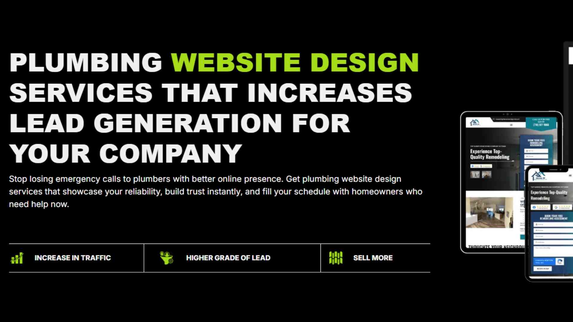
Mobile-Friendly Web Design for Plumbers
Let me paint you a scene. It is 10 PM on a rainy Tuesday. A homeowner walks into their basement and feels water soaking their socks. Panic sets in. They grab their phone. Their wet fingers fumble across the screen. They search "emergency plumber near me."
Your website loads. Or does it? On their phone, your text is tiny. Your buttons are impossible to tap. Your phone number is buried somewhere in a menu. They squint, get frustrated, and click back. Your competitor's site loads fast. Big button. Easy call. They win. You lose.
This scenario plays out thousands of times every single night. And the only thing separating you from that call is mobile-friendly design.
That is why smart web design for plumbers puts mobile first. Not as an afterthought. Not as a "we will make it responsive later." First. Because that is where your customers are.
In this guide, I will show you exactly what mobile-friendly design means for plumbers and how to stop losing after-hours calls.
Why Mobile Matters More for Plumbers Than Anyone Else
Let me be direct. Plumbers have a unique problem. Most of your best leads come from emergencies. And emergencies do not happen during business hours at a desktop computer.
Burst pipes happen at midnight. Overflowing toilets happen on Sunday afternoons. Water heater failures happen during holiday weekends.
Every single one of these emergencies sends a stressed homeowner to their phone. Not their laptop. Not their tablet. Their phone.
If your website is not perfect on mobile, you are invisible during your most profitable hours.
The Three-Second Mobile Rule
Here is a hard truth. On mobile, you have about three seconds to convince a panicking homeowner to stay on your site. Three seconds.
In that time, your site must:
-
Load completely
-
Show your phone number
-
Prove you are a real local plumber
-
Make tapping easy
Fail at any of these, and they bounce to your competitor. Mobile users have zero patience. Especially when water is damaging their home.
Tap Targets: The Most Overlooked Mobile Element
Let me explain something most designers ignore. On a desktop, people use a precise mouse cursor. On mobile, they use their thumbs. Fat, hurried, possibly wet thumbs.
Your buttons need to be big enough for those thumbs. Google recommends tap targets at least 48 pixels wide. That is about the size of a fingertip.
Here is what happens when buttons are too small. A homeowner tries to tap your phone number. They accidentally tap a menu link. The menu opens. They get frustrated. They close the menu. They try again. They miss again. They give up and call someone else.
Do not let small buttons cost you calls.
Mobile Speed: The Emergency Factor
Speed matters on every website. But it matters twice as much on mobile during an emergency.
Think about it. A homeowner with a flooded basement does not care about your beautiful logo or your clever tagline. They want to call someone. Now.
Every second your site takes to load gives them time to second-guess. To try another plumber. To give up entirely.
Mobile speed checklist for plumbers:
| Action | Why It Helps |
|---|---|
| Compress all images | Huge images kill load time on cellular data |
| Enable browser caching | Returns visitors load your site almost instantly |
| Minimize redirects | Each redirect adds a full second of load time |
| Use a content delivery network (CDN) | Serves your site from servers close to the user |
| Eliminate render-blocking resources | Lets your page show content while background items load |
Click-to-Call: Your Most Important Mobile Feature
Let me save you some money. Forget fancy animations. Forget video backgrounds. The single most important feature on your mobile site is a click-to-call button.
Here is how it works. A homeowner taps a button. Their phone dials your number instantly. No copying. No pasting. No typing.
Where should this button live? Everywhere. At the top of every page. In a sticky footer that follows as they scroll. On your contact page. On your service pages. Everywhere.
I have seen plumbers double their emergency calls just by adding a persistent click-to-call button. It is that powerful.
Mobile Forms That Actually Get Submitted
Let us talk about forms. On desktop, people tolerate long forms with many fields. On mobile, they do not.
If your contact form asks for name, email, phone, address, service needed, preferred time, and three other fields, mobile users will abandon it. Guaranteed.
Learn More: SEO for construction companies
Mobile-friendly form rules:
-
Ask for only 2-3 fields maximum
-
Use big input boxes that are easy to tap
-
Enable auto-capitalization and auto-complete
-
Never use dropdown menus on mobile (they are hard to use)
-
Replace "Submit" with a specific action like "Send Emergency Alert"
Readable Fonts Without Zooming
Here is a test. Open your website on your phone. Without zooming, can you read the main text easily? Or do you have to pinch and zoom to make it legible?
If you have to zoom, you have a problem.
Mobile-friendly web design for plumbers uses a minimum font size of 16 pixels for body text. Headings can be larger. This ensures readability without zooming. It is also a Google ranking factor for mobile sites.
Thumb-Friendly Navigation
Most websites put their main navigation menu at the top of the page. That works fine on desktop. On mobile, it is terrible because your thumb has to stretch all the way to the top.
Better approach? Put your most important actions within thumb reach:
-
Click-to-call button near the bottom of the screen
-
Sticky contact bar that lives at the bottom
-
Hamburger menu that opens from the bottom on larger phones
Design for thumbs. Not for mice.
Local Mobile SEO: Getting Found on the Go
Mobile searches are different from desktop searches. On mobile, people search while moving. They use phrases like "plumber near me" or "emergency plumber open now" or "plumber [city name]."
Your mobile-friendly design must support these search behaviors:
-
Location keywords in your headlines
-
Your address and service area clearly visible
-
Google Maps integration with directions
-
"Open now" status in your Google Business Profile
When someone searches on their phone, Google prioritizes mobile-friendly sites with local relevance. Do not miss this opportunity.
Common Mobile Design Mistakes Plumbers Make
Let me save you from these painful errors.
| Mistake | Why It Kills Calls |
|---|---|
| Pop-ups that cover the whole screen | Impossible to close on mobile. Users bounce instantly. |
| Text that requires horizontal scrolling | Users will not scroll sideways to read. They will leave. |
| Links that are too close together | Fat thumbs hit the wrong link constantly. |
| Using Flash or other unsupported tech | Flash does not work on iPhones at all. |
| Hiding your phone number in a menu | Adds extra taps to something that should be one tap. |
Testing Your Mobile Site Like a Customer
When was the last time you actually used your website on your phone like a real customer? Not just glanced at the homepage. Actually pretended you had an emergency and tried to call yourself.
Do this right now. Open your phone. Go to your website. Time yourself. How many seconds until you can tap a phone number and start a call?
Be honest. If it takes more than five seconds, you have work to do.
Responsive Design vs. Mobile-First Design
Let me clarify a common confusion. Responsive design means your site adjusts to fit any screen. That is good. But mobile-first design means you design for the smallest screen first, then scale up to desktop.
Mobile-first is better for plumbers. Why? Because it forces you to prioritize what truly matters. You cannot hide things in a sidebar or footer because those do not exist on mobile. You put your phone number front and center because you have no other choice.
Mobile-first design leads to better conversion rates on every device.
Real-World Results from Mobile-Friendly Design
I have seen plumbers transform their businesses with mobile-friendly design. One client added a sticky click-to-call button. His after-hours calls tripled in one month. Another fixed his mobile load time. His Google ranking jumped from page three to page one.
These are not hypothetical scenarios. Mobile-friendly design directly increases calls. Period.
Get Your Mobile-Friendly Plumbing Website Today
You do not need to lose another emergency call to a competitor with a better mobile site. You do not need to wonder why your phone is quiet at night while theirs is ringing.
Talk to a team that specializes in mobile-first web design for plumbers. Get a free 30-minute discovery call. They will audit your current mobile experience and show you exactly how to capture every after-hours call.
 English
 Arabic
 French
 Spanish
 Portuguese
 Turkish
 Dutch
Dutch
 Italiano
 Russian
 Romaian
 Portuguese (Brazil)
 Greek
Greek